Hi, all my crafty friends! This past week or two, I have been working on a layout of my niece, BriAnn. Because the pictures were in black and white, I wanted to do more of a mixed media type layout.
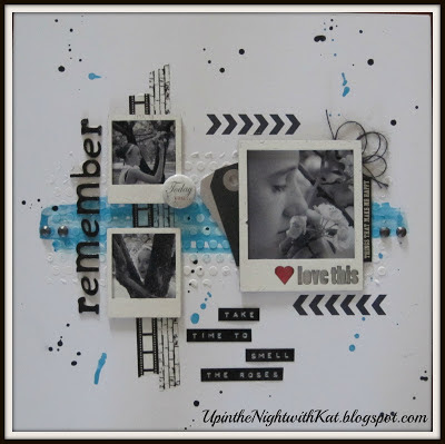
I got my inspiration for the colors from UmWowStudio's business card . . . I just LOVE the turquoise and black look. Here's how the finished layout looked:
To start this layout, I cut out a "punchella" stencil on my Cameo . . . it was actually 12x12, but I cut it into three (3) 4x10 pieces. Then using modeling paste from Studio 490, I applied it to the middle of my paper. After letting it completely dry (I waited till the next day just to be sure), And while I waited for the embossing paste to dry, I painted my chipboard polaroid frames from UmWowStudio with Mister Huey's Mist in white. Once the embossing paste was dry, I took some acrylic glaze in turquoise and applied it to some of the embossed area.
I then figured out where on my layout I was going to put my chipboard polaroid frames from UmWowStudio so I would know where to stamp my chevrons and place my washi tape. I used the chevron stamp from VLVS!. (The stamp actually had 9 chevrons but I only wanted 6, so I covered 3 with paper when I inked the stamp.) The filmstrip washi tape was from Trendy Tape and the brick washi tape was from PaperIssues' Etsy store. After that, I took some of my new Charcoal twine from The Twinery and unraveled it into 4 strings because it was a bit too thick for the look I wanted and I placed it behind the top right corner of my pictures and place 2 tags on the left. I also placed a bright pink piece a paper beneath the heart on the large polaroid frame. NOTE: To adhere my chipboard polaroid frames to my layout, I used Helmar's 450 Quick Dry Glue . . . I am absolutely in LOVE with this glue! It has a good strong hold and it does dry quick . . . though you do have a few seconds if you want to change your mind. :)
And last, but not least, after adding some bling from CTMH and a badge, I flicked my turquoise paint around my LO. And then did the same with my Silks Black Ice acrylic glaze.
Till the next time I'm up in the night. Kathy
















5 comments:
Beautiful Kathy!!!!
Gorgeous LO!!
Kathy this is just awesome!! I love this style and you took it to the next level :)!!
Absolutely Lovely! Thanks so much for sharing! That turquoise is wonderful and I love the little pop of red.
That page is beautiful! I love the design, the mix of elements, the color palette. The way you put this page together complements the photo with perfection. You used the frames from UWS wonderfully. This is such an inspiring page.
Post a Comment