CLICK HERE FOR FREE BLOGGER TEMPLATES, LINK BUTTONS AND MORE! »

Friday, August 17, 2012

Scraplift Challenge

Hi, everyone!!!  This past weekend I got together with a couple of my CC friends for a weekend of scrapping fun.  While there I did a layout I had sketched . . . using circles to make a heart.  The gals with me loved it so much that they decided to scraplift it.  In fact, Raebae had her's scraplifted and done before I finished. :)

After we got back home, Raebae and & both posted our heart layouts on CropChocolate and the response was overwhelming. (Thank you!!!)  And there were a lot of comments about scraplifting.  :)  (Which I feel is the GREATEST compliment.)

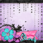
Here's what mine looked like:


Here's what Raebae's looked like:


A few also commented about how different each looked because of the different paper/styles.   And we agree.  Because of this, Raebae and I decided we would have a "Scraplift" Challenge.  And by participating, both of us are offering some wonderful blog candy from our stashes. :)  (Just a quick note:  This is NOT a CropChocolate challenge, this is an individual challenge .)

Here's what you need to do to be eligible - Do a new project (layout, card, altered art, etc) by "scraplifting" my heart layout . . . adding, subtracting, changing or keeping the same, however you are inspired.  Once you have your project done, come back here and link it up to Mr. Linky below so everyone can see what you did.  You can link up by posting on your blog or any online photo sharing site . . . you can even post under your profile on CropChocolate.  Then leave a comment that you did so.  Also, go to Raebae's blog and do the same.  Here's the link:  http://kitchentablescrapper.blogspot.com/

You have till Sept. 1 at 10am Central to post your project . . . so let's get started and have some fun!!!  I can't wait to see what everyone comes up with.


Till the next time I'm up in the night.  Kathy

Wednesday, August 8, 2012

Winner of advice challenge

During CropChocolate's Design Team's first blog hop "Banners", I had a layout I felt it still needed something.  So I decided to have a little contest by coming to you, my followers, and asking for advice . . . and whosever advice I took, would get a little special something.  If there were 2 or more with the same advice, I would draw names.

Well, I LOVED all the advice and played around with all of it.  There ended up being more than one thing I did . . . in fact, I ended up doing 6 things.  So before I tell you who won, I thought I would show you what I did and why I did it.  

Here's what it looked like after I made changes:


First, you will see that I added a tiny banner to the upper left corrner.  A lot of you commented that it needed something and one of you said maybe a tiny banner with the year.  I also put a little star above the banner because it felt lopsided without it . . . if you look, the twine at the bottom went clear to the bottom right corner, so something needed to go to the right corner.

Second, I added some bling to the upper left edge of the circle under the picture to help balance the yellow with the right side . . . a few mentioned doing something to the right side of the circle and one person suggested bling.

Third, some mentioned that my photo blended into the background and I agreed . . . so I added a white photo mat.]

Fourth, I added bling under the banners . . . I agreed when someone said they needed a little more.  I tried just yellow bling, but it was too much yellow.  So I tried orange bling, but it grabbed all of your attention.  So I decided to alternate the bling . . .yellow and orange.

Fifth, I changed the yellow brad to a white w/ pattern brad.  It was mentioned that the yellow brad seemed to blend in and to use a pink brad . . . but again, a pink brad pulled all of your attention,  so I decided to use another white w/ pattern brad, though different from the other two (2), to help it flow better.

The Sixth and last thing I did was use Picket Fence to the edges of the layout,  It helps finish the layout by giving it a "finished" look and tying everything together.

So what do you think?  If you think it is too much, please let me know . . . or if I hit the right balance, please let me know that too.  I love getting some lovin', even when it is gentle criticism. :)

Okay, onto the winners . . . since I took more than one piece of advice, I decided to draw (2) names.  And they are . . .

{{drum roll, please}}
Ambra Bowles
and
NinaN

Please email me at clayton528@aol.com  or PM me on CropChocolate with your real name and mailing address.  Once I get both of your addys, I'll get your "surprise" in the mail.  Thanks!!!

Till the next time I'm up in the night.  Kat

Friday, August 3, 2012

Challenge #24 - Happy Birthday (a little latte)

Last week on CropChocolate, the weekly challenge was a fun one.  Here's what it said:  "This week's challenge is for EVERYONE! This week it's all fun with no rules or guidelines . . . It's a "do whatever you want" challenge. Make something new (layout, card, altered art, etc.) out of 50% or more CropChocolate products and enter it for a chance to win cropcredit. That's it! Have fun and show us your fantastic creations!"


After much thought, I decided to do a card since I still needed to make one for my sister-in-law for her birthday.  I had seen a card on Pinterest using the "water stain" stamp in 3 shades of brown making it look like coffee rings . . . the card said "Hope your birthday is good to the last drop".  Well, since I was late in getting a card and gift to my sister-in-law, I decided to do the "coffee rings" and use a different saying.  Here's what I came up with:


Supplies
CC Products
 "Note to Self" paper collection by EP
Tan/Brown EP cardstock
twine from JilliBea
 button from Fancy Pants
Walnut Stain distress ink
Black Soot distress ink
Snake Tape 
NonCC: White cardstock; stamp from Skipping Stones Design; and Milk Chocolate Liquid Pearls

As I said earlier, I got inspiration for this on Pinterest . . . I had been trying to thing of a way for the watermarks.  And since I was late in getting this card done, I thought using 3 shades of brown for "coffee rings" (or "latte rings" in this case) would be great.   But I had one little problem . . . I only had 1 brown ink and 1 black ink.  So I decided to experiment by using those 2 inks for this (Black Soot and Walnut Stain distress ink). 

After experimenting with different techniques using just the 2 inks, here's what I finally decided to do.  For the 1st ring (the darkest ring), I used both inks to get it dark.  For 2nd ring (the medium shade), I used only Walnut Stain.  And then for the lightest ring, I also used Walnut Stain, but I stamped it first on scrap paper to remove some of the ink, then stamped the 3rd ring with the rest of the rings. Note: I did NOT clean my stamp off after each time so I'd get a "dark" part around the edge of each ring.   I liked the way it turned out.  What do you think?

Till the next time I'm up in the night.  Kathy