


For Challenge #21, we were to come up with "A home decor project or altered item using neutrals and one main focal color." At first, I was a little intimidated with this challenge. Most of my creations are layouts . . . once in awhile I do do something different. But a home decor project or altered item? My 1st home decor project was my "out-of-the-box" project for part of my submission for CropChocolate's Design Team and I can't recall right offhand the last altered item I did. So on went my thinking cap . . . and while I was shopping I came across some clipboards. I remembered seeing one on Pinterest that I knew I wanted to do because of the paper used, so I thought I'd give it a try. Here's what I came up with:

Supplies
CC Products
Authentique Genuine "Friendship" paper
Authentique Gathering collection pad (blue background)
Stella & Rose 12x12 paper, trim, & cardstock stickers by MME
Bazzill paper flowers
and Walnut Stain distress ink.
NonCC: clipboard; MM paint in "Shopping Bag"; and "Say It with Crystals" by Prima
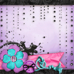
For Challenge #22, we were to "Create a project using pastels combined with dark bold colors and a bit of bling thrown in for good measure". So once again, I went through my paper trying to come up with a color combination . . . thinking maybe I could find a patterned paper that had pastels and a dark, bold color and work from that. I ended up finding some beautiful butterfly paper from the "Hello Spring" mini theme by Echo Park. The butterflies were not only in pastels, but also a nice dark, bold turquoise color. So going through my paper again, I found some coordinating colors (there were only 2 that came with the collection and were pastels). I found a pink from "Springtime" by Echo Park and a dark, bold turquoise from "A Walk In the Park" by Echo Park. Here's what I came up with:

Supplies
CC products:
"Hello, Spring" Mini Theme by EP;
"Fresh Flowers" from Springtime paper collection by EP (pink);
"Blissful Day Boarder" from A Walk in the Park paper collection by EP (dark turquoise)
Dear Santa rhinestones by MME (red)
Walnut Stain distress ink
and Snake Tape
Non CC: Misc rhinestones (green) from stash and buttercup twine (mfr not on it)
I didn't put a picture on it right away because not only had I wanted to show off the dark bold color, I also needed to find the "right" picture. I ended up printing a picture of my daughter on a horse at camp. I choose that one because every year, she used to get "spring fever" and couldn't wait to get to camp to ride the horses or to go see her favorite horse "Abby" at a friend's ranch.
Well, that's it for catching up on my CC Challenges. What do you think? I was pretty happy with how they came together. Anyway, I'll be posting this week's challenge, either tomorrow or Tuesday . . . I already have it done. In fact, I was actually the 1st one to post my project this week . . . a first for me since I usually post the last day or so. :) And make sure you come back on the 27th for a blog hop . . . can't say anymore than that, but you'll have fun. :)
Till the next time I'm up in the night. Kathy


2 comments:
I love the "chevron" look of your clipboard and the happy butterflies on your LO! Great projects, Kathy!
I love your projects . . . particularly your clipboard. Great Work.
Post a Comment